
As most training professionals agree, eLearning allows instructional designers to bring content to life and engage the learner, and there are a variety of different deliverables that can be leveraged to accomplish those goals. One eLearning approach to breathe life into learning is to incorporate interactive infographics into the curriculum.
An interactive infographic is based on two factors that appeal to the modern learner:
- it is highly visual, providing short bursts of content, and
- it employs movement by allowing the learner to select one of the graphic representations of the content and delve deeper into its meaning or importance.
Merriam Webster defines an infographic as “a chart, diagram, or illustration (as in a book or magazine, or on a website) that uses graphic elements to present information in a visually striking way.” An effective infographic, however, also interprets the data by telling a story that can be easily grasped on first view and inspires the viewer to look deeper into the information and uncover more background content that underlies the graphical representation. It helps learners see something that they didn’t see before.
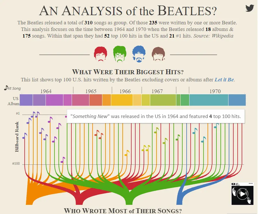
The following is an excellent example by @adamemccann at Duelingdata of how an interactive infographic can tell a story through data visualization. Click on the image below to try it yourself:
As Jason Lankow, Josh Ritchie, and Ross Crooks wrote in their book Infographics: The Power of Visual Storytelling “Infographics provide a format that utilizes engaging visuals that not only appeal to an audience hungry for information, but also aid in the comprehension and retention of that material.” One of the roles of learning professionals is to both evaluate ways to provide learners with the information they’re “hungry” for in order to better perform their jobs AND incorporate approaches to help learners comprehend and retain that information. Infographics are a way to help the content stand out and separate that content from all the competing topics accosting learners in today’s information-overloaded world. They are a way to showcase the critical need-to-know content that generally gets overlooked in numerous well-written learning objective statements.
Once the infographic story has been designed visually, the interactive element is what brings it to life. If the infographic has done its job effectively by inspiring the viewer to want to know more, then the interactive aspect engages the viewers as they seek out that deeper level of knowledge. This interactivity can be accomplished in a variety of ways. In its simplest form, learners are allowed to select one aspect of the infographic and then display additional content in what’s traditionally referred to as a pop-up box.
Web links provide another approach to adding simple interactivity to a static infographic and enabling learners to selectively explore aspects of an image that they find most compelling, ultimately allowing for a more personalized learning experience. Other approaches to adding interactivities to infographics can easily be found by searching YouTube, which showcases a variety of ways to animate content from using PowerPoint to incorporating specific animation tools that bring the content to life.
Learning professionals are inundated with statistics about how quickly all their hard work designing courses is forgotten by learners unless they come up with the next best solution to help their audience retain the content. Interactive infographics are one of the tools in the designer’s toolbox to help breathe life into data and make the content memorable.
About the author: Jan Ananian is CLD’s Director of Instructional Design